Scaling design quality
beyond the design team
Created a shared design foundation that AI coding agents and teammates could use to build more consistent internal applications.
- Role:
- Sole Product Designer
- Team
- Me (Independent work)
- Timeline
- Ongoing
01 / The Problem
Everyone could build. But nothing felt consistent.
At Flent, people across the organization use AI to build tools for their own workflows. While this made development more accessible, it also introduced inconsistencies in components, typography, and interaction patterns. People were repeatedly making the same design decisions, often using different libraries or whatever their AI agents generated.
The challenge: How could we make consistent UI easier to build without requiring a designer's involvement every time?
02 / The Approach
A design system built for AI workflows.
A traditional Figma library wouldn't be enough. Most people were building directly with AI coding agents, not designing screens first. So I decided to make the design system usable within their development workflow. The goal was to reduce the need to recreate or repeatedly correct common UI patterns. I focused on three things:

Design foundations — Define the visual language and reusable UI patterns.

AI-readable guidance — Translate those decisions into instructions an AI coding agent could follow.

Working components — Provide a browsable component reference and test the system through an actual application.
03 / What I Built

I created a design system covering 16 sections and 29 components, including typography, colours, spacing, inputs, navigation, and feedback patterns.
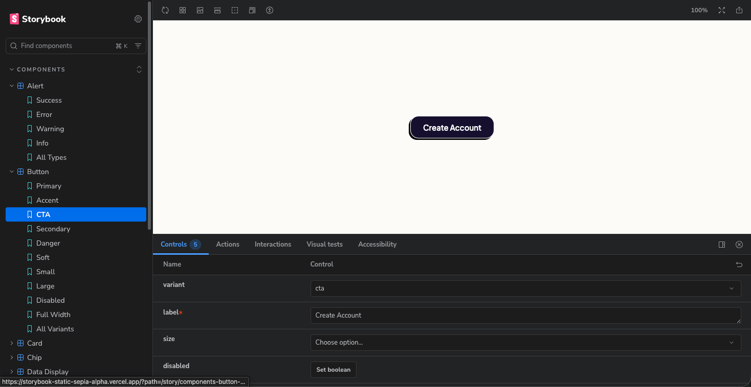
I then documented the conventions in a SKILL.md file and built a Storybook library to make the components accessible during AI-assisted development.
04 / Testing the System
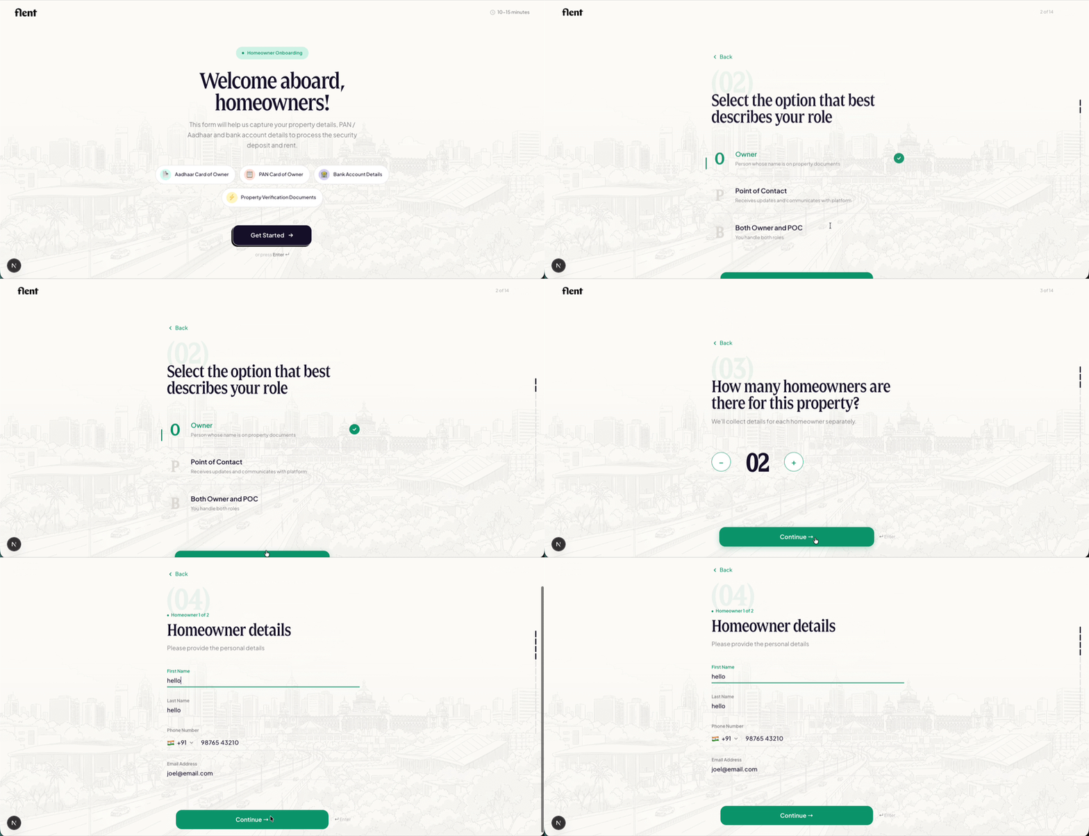
I wanted to validate the system beyond individual components. Since we frequently used Typeform internally, I built a similar form platform using AI-assisted development and the shared design guidelines. This tested how components worked together across inputs, selections, navigation, validation, and feedback. The result was a functional application following the established design language.
05 / Results & Learnings
Early team adoption : Some teammates began using the system, making shared design decisions accessible beyond the design team.
AI accelerated my design-to-build workflow : I could move from ideas to working interfaces, test interactions, and iterate without a traditional design-to-development handoff.
My biggest learning?
AI makes building faster, but good design still requires clear direction, strong foundations, and human judgment. The better the system guiding AI, the less time I spend correcting its output.